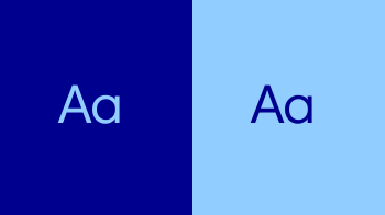
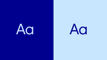
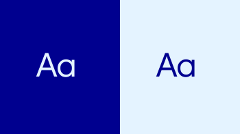
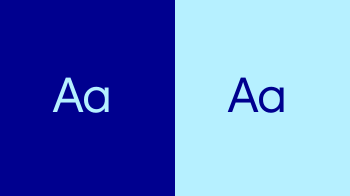
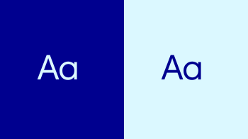
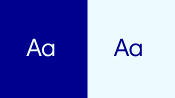
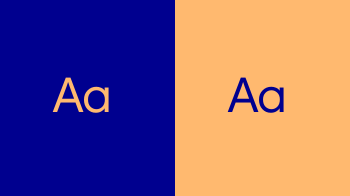
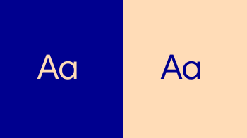
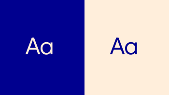
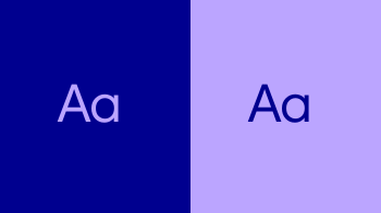
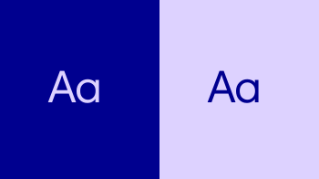
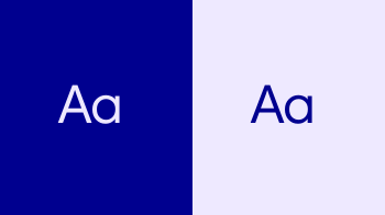
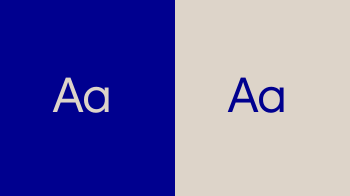
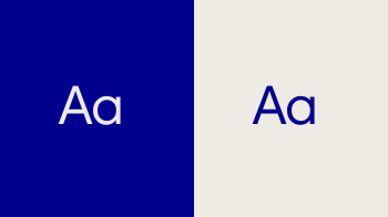
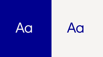
Blue has long been at the heart of the Novo brand, creating recognition, continuity and trust over time. Today, it has evolved into Lasting Blue, a more saturated, bolder expression that strengthens its presence while building on its heritage.
Lasting Blue should remain dominant throughout our communications, ensuring the brand always feels distinctive, familiar and unmistakably Novo.


Lasting represents endurance: trust, continuity and long-term commitment.
Now represents urgency, energy and momentum, expressed primarily through Now Turquoise.
The secondary colour palette provides warmth, optimism and humanity, while supporting the functional needs of information-led communications. Together, they create a connected colour system that balances long-term commitment with the progress happening today.



Our colour system is applied around carefully balanced proportions. Colour proportions should be considered across the overall application or experience. Individual pages, slides, screens or executions may vary depending on content, format and function.
Lasting Blue should anchor every expression of the Novo brand through colour fill, typography, the logotype or other brand elements, creating a consistent and recognisable presence across touchpoints.
Proportions are directional rather than exact. Individual layouts may vary depending on content and function, but white, Now Turquoise and the secondary colour palette should remain supporting elements, with Lasting Blue providing the defining brand signal.



Lasting Blue is the defining Novo brand colour and anchors both colour application modes.
Now Turquoise introduces energy, urgency and momentum. Its role varies by application, from a focused supporting accent in brand-led communications to a more active functional colour in information-led communications.
White provides clarity, openness and breathing room across the system.



The secondary palette expands the Novo colour system, providing greater flexibility across information-led communications and data visualisation. The secondary colour palette must not be used in brand-led communications and applications.
In information-led communications, secondary colours may be used where colour helps organise information, distinguish categories or clarify complex content. Use only as much colour variation as the content requires.








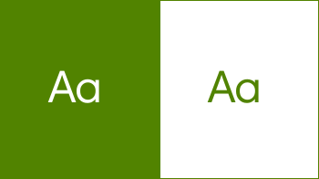
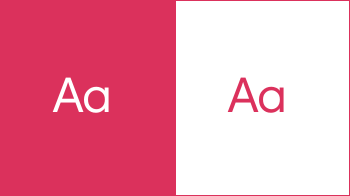
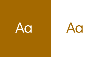
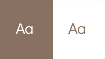
The tertiary palette extends the colour system for data visualisation only. Use these colours when greater contrast or additional colour values are needed to distinguish data series, categories or values.
Tertiary colours should not be used for general information-led communications, layouts, typography or brand-led applications. Use only as many tertiary colours as the data requires.








In brand-led communications, Lasting Blue provides the strongest overall brand signal. Use White to create clarity and space, with Now Turquoise applied selectively to introduce energy, emphasis and momentum.


Information-led communications use colour more functionally. In presentations, reports, investor communications and other content-rich applications, colour may be used to organise information, distinguish categories and create clear hierarchy.
Lasting Blue remains the anchor and dominant colour, particularly on covers, section and quote slides, colour-fill areas and typography. The secondary colour palette may play a greater role where colour improves clarity or understanding.
Use tertiary colours only within data visualisation when greater contrast or additional colour values are needed. Colour should always serve the information. Use secondary colours first, introducing tertiary colours only where needed to distinguish complex data.


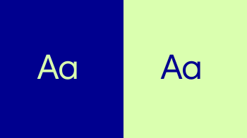
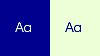
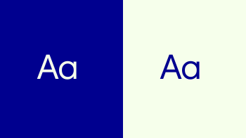
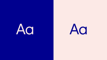
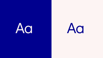
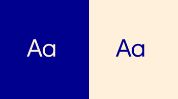
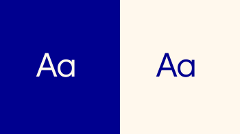
Lasting Blue should always appear at its full value (100%) to preserve its depth, consistency and recognisability. Never reproduce Lasting Blue in tints.
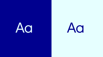
White should be used as a canvas colour to create space and clarity throughout communications. Use it alongside areas of Lasting Blue to establish contrast, rhythm and balance.
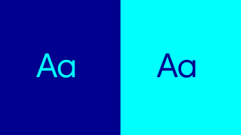
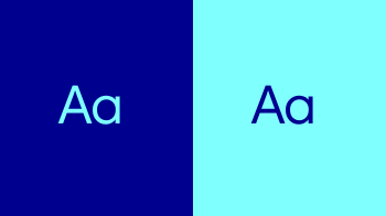
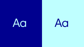
Now Turquoise and its tints may be used selectively to create emphasis and hierarchy across typography, design elements and section backgrounds. Follow the proportional colour principles when determining its overall presence.






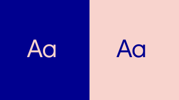
Secondary colours and their tints should be used with restraint and only within permitted applications. They must always support, not compete with, the dominant presence of Lasting Blue.
Tints provide additional flexibility when separating information or creating subtle emphasis. Use only as much colour variation as the content requires.
















Black and neutral greys are functional support colours within the Novo visual system. Use them to create quiet space, structure information, distinguish content areas or provide a neutral alternative where colour reproduction is limited.
They may be used for backgrounds, rules and dividers, tables, charts and other information-led elements. They should support the primary colour palette rather than become a dominant or expressive part of the visual identity.
For typography, use Black for long-form, small-scale or dense areas of text where readability is the priority.








WCAG defines large text that is 18 pt (24 px) and larger, or 14 pt (19 px) and larger if bold.
WCAG defines normal text at 12 pt (16 px) is recommended for body copy while small text may not be smaller than 9 pt (12 px).