
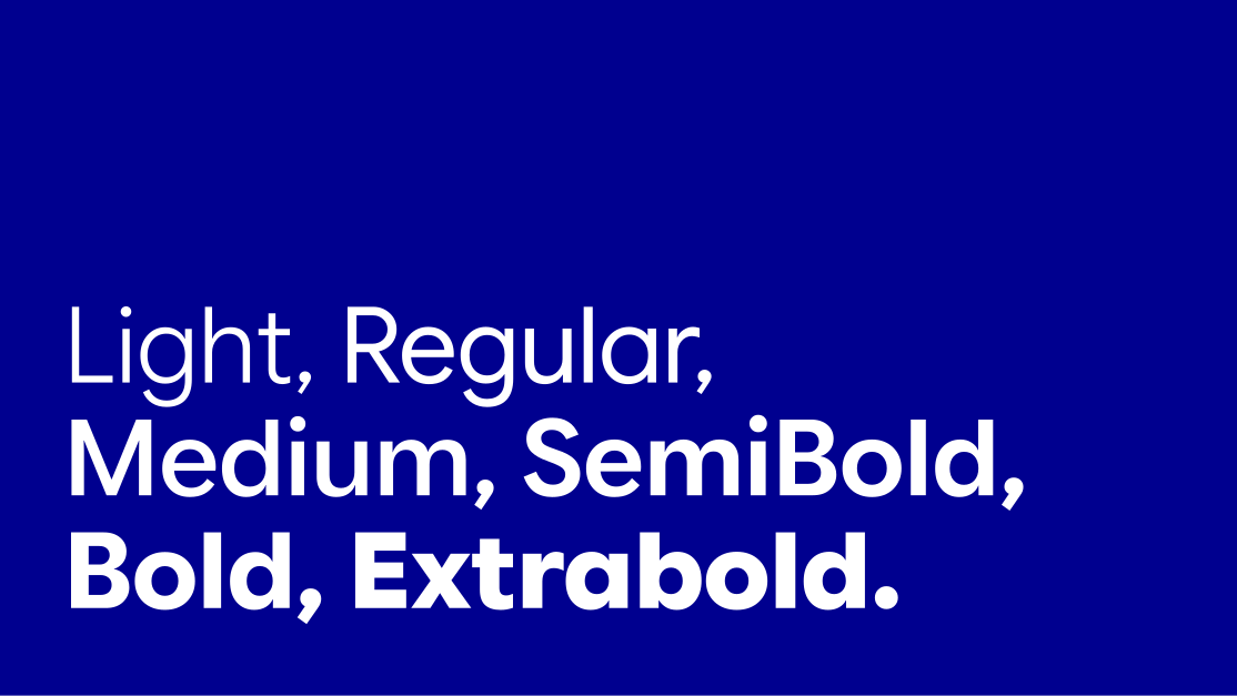
The Novo type family provides a flexible range of weights to create hierarchy, emphasis, and rhythm throughout a layout.
Light and Regular are best suited to large headlines, statements and editorial typography. Medium and SemiBold add structure and hierarchy, while Bold and ExtraBold are reserved for emphasis, call-outs, navigation and key information.
Using weights consistently creates a balanced, recognisable typographic system across every touchpoint.
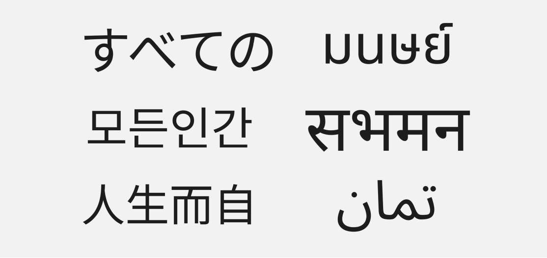
Use Noto Sans for non-Latin language content. Its clear, open forms provide broad language coverage while maintaining a consistent visual relationship with the Novo brand typeface.
Select the appropriate script-specific Noto Sans family and use the closest equivalent weights to preserve the intended hierarchy.
Adjust size, spacing and line height where necessary, as character proportions and reading conventions vary between languages.
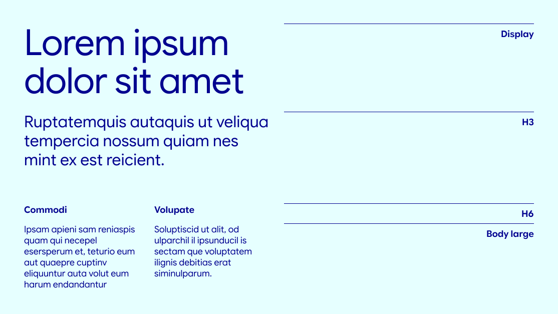
Use Lasting Blue as the primary text colour for headlines, short paragraphs and supporting copy on light backgrounds. For longer, text-heavy content, black may be used to support legibility.
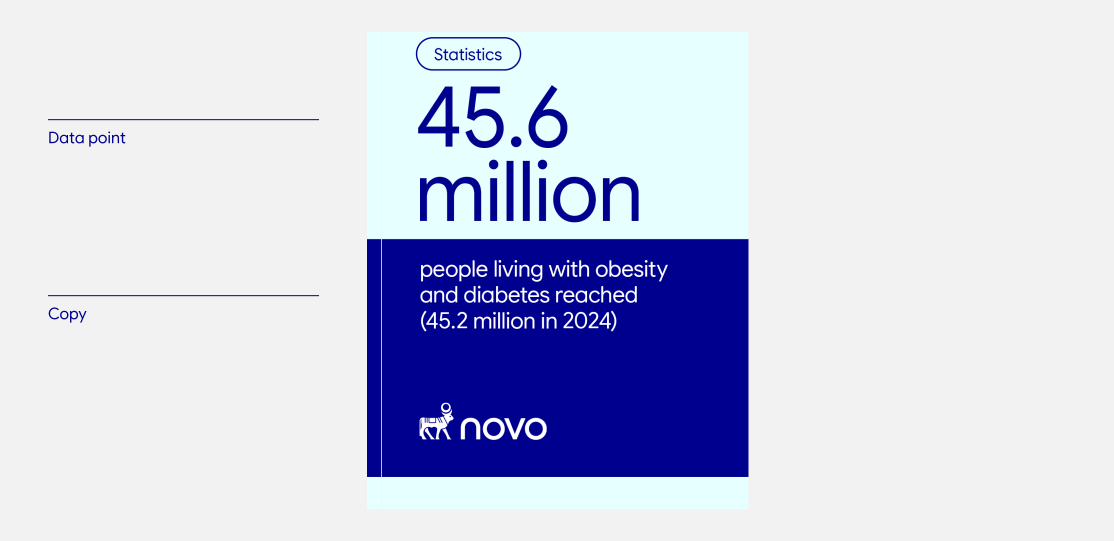
Editorial typography uses hierarchy, scale and contrast to guide the reader through content. Headlines, pull quotes and key statistics can be more expressive, while body copy and supporting information should remain simple, structured and highly legible.
Use differences in scale and weight purposefully to create emphasis and establish a natural reading order across the layout.
For long-form editorial and report content, use black for body copy to support legibility. Lasting Blue may be used selectively for introductions, short supporting text and emphasis.


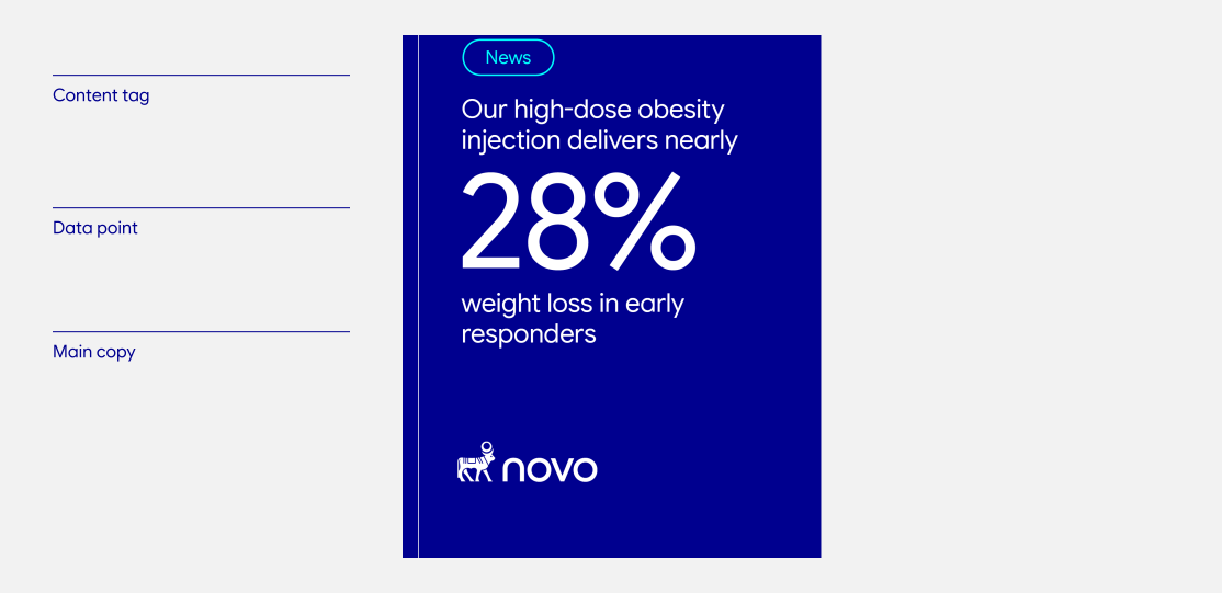
OOH typography should be immediate, clear and easy to understand at a glance. Use concise messaging, a strong hierarchy and generous spacing to maintain legibility across formats, viewing distances and environments.
Headlines should communicate one clear idea and be concise enough to read quickly. Limit supporting copy to essential information, while keeping URLs and calls to action clearly visible without competing with the primary message.
The examples shown demonstrate two levels of OOH messaging: a simple headline-led application and a more detailed composition with supporting copy. Adjust type sizes proportionally to the format and anticipated viewing distance.


For wide-format OOH, scale typography to the dimensions, placement and expected viewing distance of the application. Maintain a clear hierarchy so the primary message remains immediate and easy to understand.
The example shown demonstrates how headline, supporting copy, URL and calls to action can work together across a wide-format composition while maintaining clarity and balance.

Centred typography may be used for primary messaging to create a clear focal point and strong visual presence. Use generous spacing and keep supporting copy concise to maintain clarity, balance and impact.

Type may interact with photography where it strengthens the composition, but always maintain sufficient contrast and ensure the message can be understood quickly. Use a clear, dominant headline and keep supporting copy concise. Scale typography in response to the format, viewing distance and environment.
Overlap only the final few letters of a word, ensuring the type remains legible and maintains sufficient contrast. Use this treatment only on words of three letters or more, and position the overlap carefully to avoid awkward shapes, tangencies or unclear letterforms.

Editorial covers combine a clear typographic hierarchy with a bold, hero-scale logotype. Keep the title concise and position supporting information so it remains secondary to the main message.
Place the hero-scale logotype along the bottom of the cover, aligned to the grid and margins. Over photography, maintain strong contrast, avoid visually busy areas and ensure the full logotype remains legible and unobstructed.


