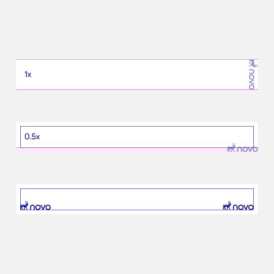
Our layout system provides five flexible approaches for combining photography, typography, colour and brand elements across communications.
Layouts may use full-bleed imagery, colour blocking, sequences, multiple images or typographic overlap. Choose the approach that best supports the content, format and intended message.
Across every layout, maintain clear hierarchy, consistent spacing and strong brand recognition. Lasting Blue should remain predominant, while photography and supporting colours add energy, warmth and variety.


Full-bleed photography creates an immediate and immersive connection with the subject. Position typography carefully within areas of natural contrast, maintaining clear hierarchy, legibility and the required clear space around the logotype.
Use this approach when a single image can carry the message with emotional impact.


Colour blocking combines photography, typography and brand colour within a clear, structured composition. Use Lasting Blue as the dominant colour, with Now Turquoise applied selectively to add energy, emphasis or a sense of immediacy.
The balance of image and colour may adapt to the format, while the overall composition should remain simple, bold and easy to navigate.


Sequential layouts create a connected story across multiple panels, frames or placements. Vary photography, colour and messaging to establish rhythm while maintaining a consistent visual relationship between each element.
Use sequence to build anticipation, reveal information over time or connect individual messages as part of a larger narrative.


Multiple-image layouts bring together different perspectives, people, and moments within one composition. Use a clear grid and consistent spacing to create order, allowing one image or message to lead while the others provide context and depth.
Image scale and placement may vary, but the overall layout should feel balanced, purposeful and connected.


Typographic overlaps allow messaging to interact directly with photography, creating a more integrated and expressive composition. Headlines may cross between colour and image to connect the elements of the layout.
Position type carefully to maintain clear contrast and legibility. Keep messaging concise, and ensure the photography remains visible and emotionally engaging.


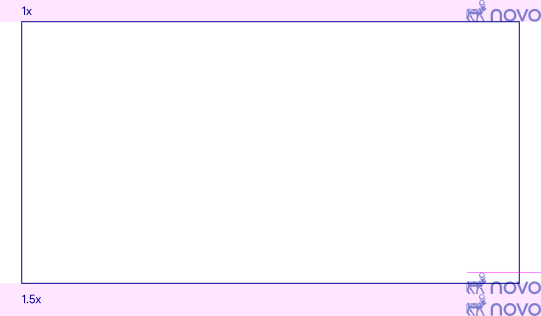
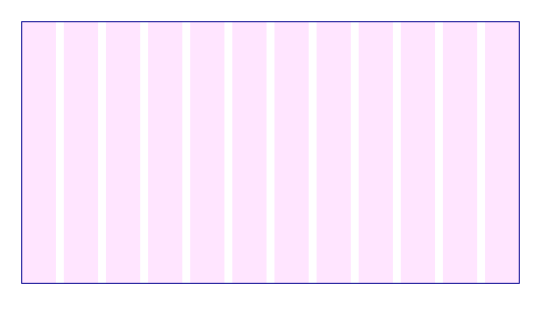
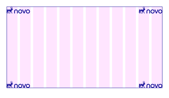
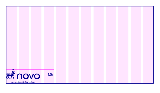
Horizontal layouts use a consistent framework to create balance across wide-format communications. The following steps establish the logotype size, margins and grid, while allowing the composition to respond to the needs of each application.
For especially wide formats, such as banner advertising, use the framework as a starting point. Margins and logotype size may be adjusted to maintain visibility, balance and impact.
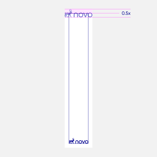
Vertical layouts require careful use of height and negative space. Apply the sizing and margin principles shown here to create a clear relationship between the logotype, grid and surrounding content.
In especially tall or narrow formats, adapt the proportions to suit the available space. Prioritise clear logo visibility and a composition that feels intentional rather than overly constrained.
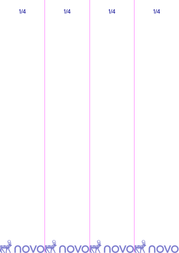
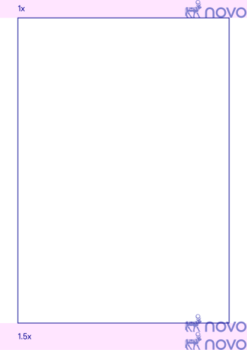
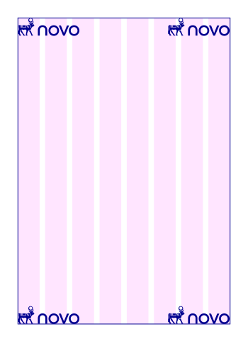
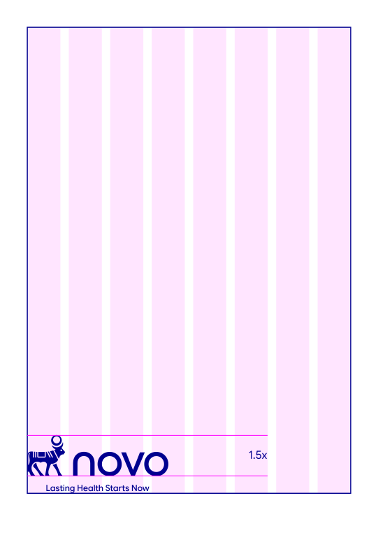
For display advertising and social content, use a simplified grid that responds to the format and amount of content. Determine the logotype size in proportion to the shortest side, with equal margins on all sides.
For social content, follow each platform’s specific clear space and safe area requirements for logotypes, copy and graphic elements.
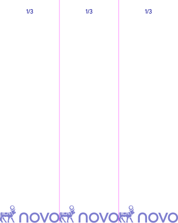
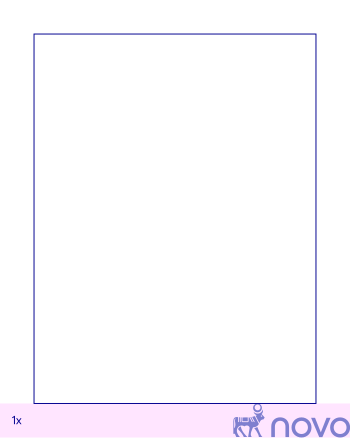
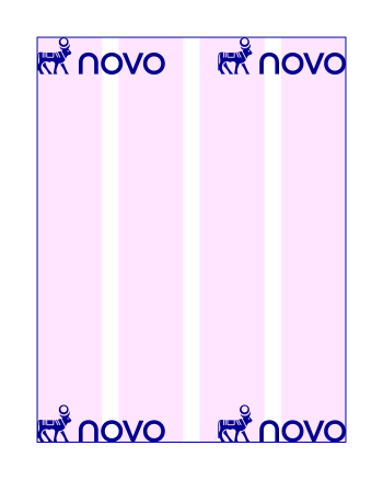
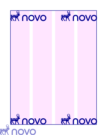
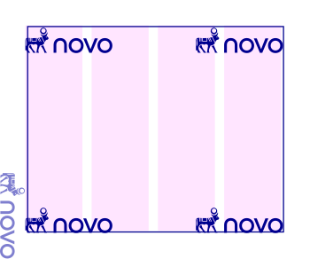
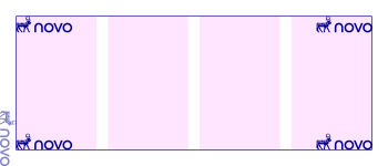
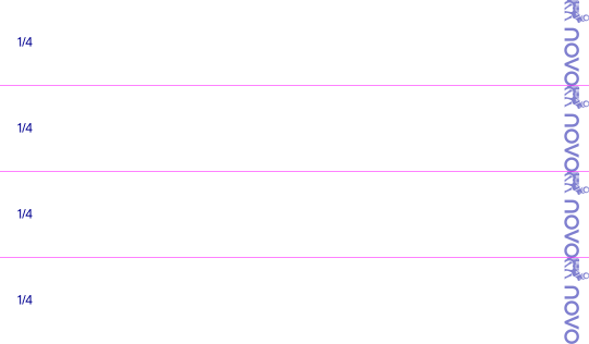
For extreme horizontal and vertical formats, use the shortest side to establish the logotype scale. Adjust its size and placement as needed to achieve the best balance of impact, legibility and clear space.