The Novo wordmark system brings our programmes, platforms, services and pipeline R&D together within one recognisable system. The Novo parent brand provides the strongest point of connection through a clear and consistent visual relationship.
Wordmarks for key programmes, platforms and services that reach external audiences use the Novo wordmark and our typography as consistent elements across the system. This creates recognition and cohesion while allowing each expression to retain its distinct name and purpose.
Named programmes and initiatives should create recognition through the Novo system, not through separate visual identities or logos.


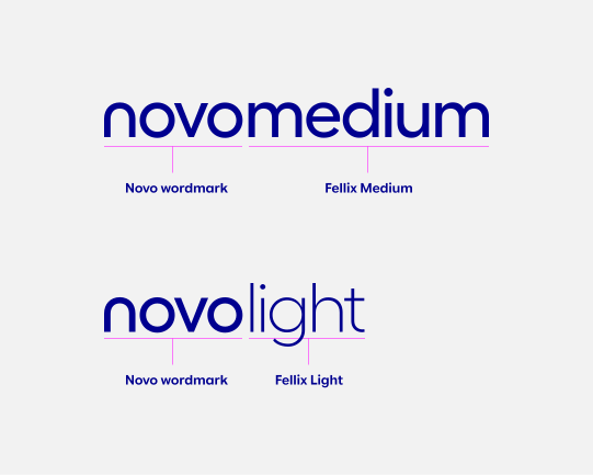
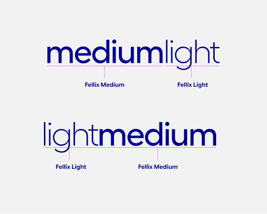
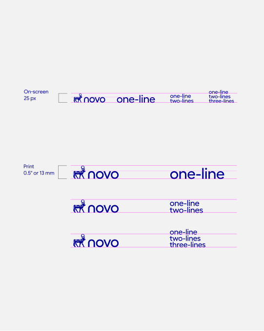
Use a 1 line construction for short names that remain clear and legible at the intended size. Where a name contains multiple words, set them together without additional word spacing to create a distinctive, unified wordmark.
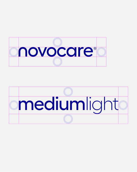
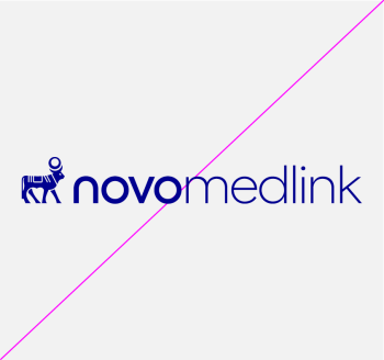
Follow the approved weight, tracking and alignment specifications shown here. Where “novo” forms part of the name, match the x-height of the adjoining type to the Novo wordmark and align both elements on a common baseline. Do not introduce additional spacing between them.
Wordmarks containing “novo” should remain on 1 line, with “novo” and the adjoining name treated as a single continuous unit. Do not break the wordmark across two lines.

A 3 line construction may be used when “novo” forms part of a longer name. Keep the Novo wordmark intact and set the remaining words in Fellix Medium.
Balance each wordmark optically, using natural line breaks and subtle shifts in alignment where needed to create a cohesive composition and clear reading order.
Multi-line constructions are reserved for specifically designed and approved wordmarks, where the name requires a more considered composition.

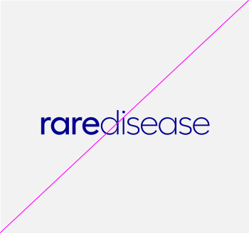
Where “novo” is not part of the name, use contrasting Fellix weights to distinguish words. Keep the wordmark on 1 line where it remains clear and compact.



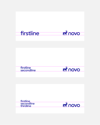
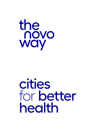
Use a 2 line construction when the name divides naturally into two clear parts. Break the name at a logical reading point and keep both lines left aligned. Aim for visually balanced line lengths without disrupting how the name is read.
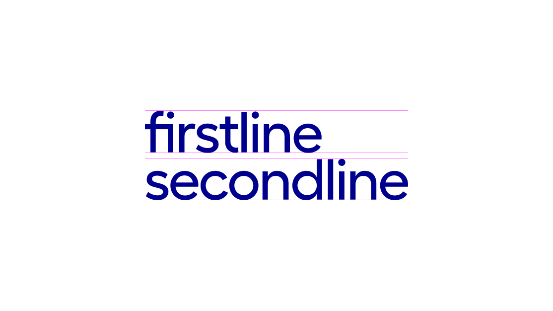
Use a 3 line construction for longer names that require a more compact format. Break the name at natural reading points, keeping all lines left aligned and visually balanced. Maintain the same type size and line spacing throughout.

For websites and other approved digital applications, wordmarks may be set as live type rather than supplied as fixed artwork. This allows the wordmark to be implemented directly through the website style sheet while retaining the approved wordmark construction.
The live-type wordmark should visually match the approved construction and should not be altered by default browser styling. Use the approved Novo font and specified weights, casing, tracking and colour.
The example below shows how a wordmark is written directly as live website text rather than placed as an image asset.